Example
Note
Want more details or just prefer to run the code yourself? This example is also available in our test notebook.
Suppose you have a dataset (“Population A”) that you want to compare to a reference population (“Population B”). Assessments of the distributional similarity would typically be done by looking at the histograms of the different attributes:
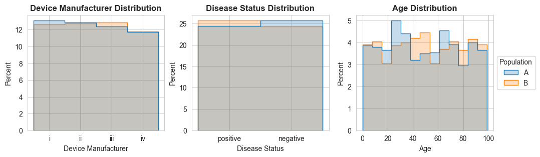
If you looked at those histogram distributions, you’d probably say that the two populations have similar distributions. But those histograms don’t show the full picture.
DART distributional similarity analysis of the two distributions suggests that the distributional similarity of some of the subpopulations isn’t quite as high as the similarity of the entire populations.
Subgroup Attributes |
Similarity From |
Similarity (mean) |
|---|---|---|
Disease Status |
Age |
0.950 |
Device Manufacturer |
Disease Status |
0.983 |
Disease Status |
Device Manufacturer |
0.983 |
Device Manufacturer |
Age |
0.998 |
N/A |
Disease Status |
0.999 |
N/A |
Age |
0.999 |
N/A |
Device Manufacturer |
1.000 |
In particular, the similarity of the the Age distributions between the subpopulations defined by Disease Status (first row of the table) seem quite low.
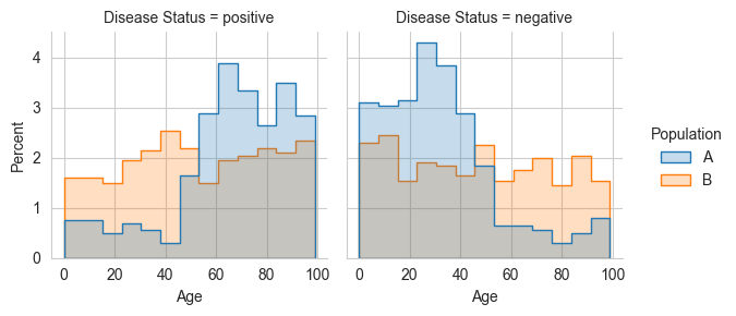
This skew is quite apparent from the subpopulation histogram, but without the DART distribution similarity measurement, we wouldn’t have known to look at the histogram at all. Afterall, for this simple dataset, there are a minimum sixteen subpopulations to look at (assuming ages are binned by decade):
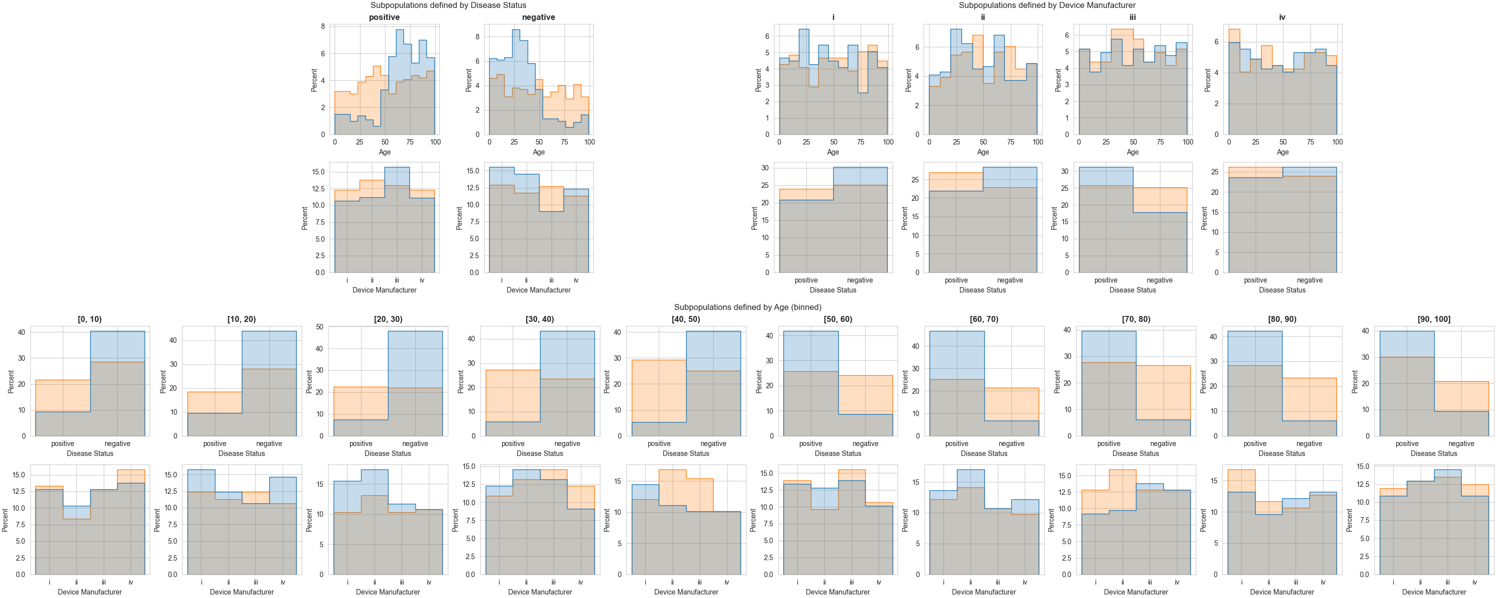
… And that’s assuming that you’re only looking at subpopulations defined by a single attribute.